Embarked 탑승한 항구
f, ax = plt.subplots(1,1,figsize=(7,7))
df_train[['Embarked','Survived']].groupby(['Embarked'],as_index = True).mean().sort_values('Survived',ascending=False).plot.bar(ax=ax)
plt.show()

💡 S항구에서 탑승한 탑승객들의 생존 확률이 가장 낮았고 C항구에서 탑승한 탑승객들의 생존 확률이 S항구와 Q항구보다 더 높았다.
📌 Embarked를 기준으로 나눈 Survived의 평균 정렬방법.
1. .sort_values('Survived') => Survived의 평균을 기준으로 정렬
df_train[['Embarked','Survived']].groupby(['Embarked'],as_index = True).mean().sort_values('Survived')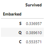
2. sort_index() => index인 Embarked를 기준으로 정렬
df_train[['Embarked','Survived']].groupby(['Embarked'],as_index = True).mean().sort_index()
f, ax = plt.subplots(2,2,figsize=(15,12))

sns.countplot('Embarked', data=df_train, ax=ax[0,0])
ax[0,0].set_title('(1) No. Of Passengers Boared')

sns.countplot('Embarked', hue='Sex', data=df_train, ax=ax[0,1])
ax[0,1].set_title('(2) Male-Female split for embarked')

sns.countplot('Embarked', hue='Survived', data=df_train, ax=ax[1,0])
ax[1,0].set_title('(3) Embarked vs Survived')

sns.countplot('Embarked', hue='Pclass', data=df_train, ax=ax[1,1])
ax[1,1].set_title('(4) Embarked vs Sex')

plt.subplots_adjust(wspace=0.3, hspace=0.5) # 각 plot간의 간격 조정
plt.show()

📌 countplot
✔ countplot은 말 그대로 지정된 항목의 count, 데이터 개수를 카운트해 주는 것이 countplot이다.
💡 (1) - S항구에서 가장 많이 탑승했다는 것을 알 수 있다.
(2) - 항구별 성별 비율을 알 수 있는데 S항구에서 남성이 여성의 2배 이상이 탑승했다는 것을 알 수 있다.
(3) - 항구별 생존 수를 알 수 있는데 S항구에서 탑승한 탑승객 수가 많은 만큼 S항구 탑승객들의 생존 수가 가장 많지만 생존율을 보았을 때 C항구의 탑승객이 가장 많이 생존한 것을 알 수 있다.
(4) - 항구별 객실등급에 따른 수를 알 수 있는데 유독 Q항구에서 높은 클래스의 탑승객들이 없다는 것을 알 수 있다. S와 C항구 탑승객이 1st 클래스에 많이 탑승한 것을 알 수 있다.
✔ barplot의 형태로 나타나는 countplot을 barh의 형태로도 나타낼 수 있다.
✔ 나타내고자 하는 열을 x가 아닌 y에 입력해 주면 자동으로 x축에는 count 값이 입력되어 barh 형태로 countplot이 출력된다.
sns.countplot(y = 'Embarked', data=df_train,)
plt.title('No. Of Passengers Boared')
'Study > kaggle' 카테고리의 다른 글
| 캐글 타이타닉 Titanic - 8. EDA - Fare, Cabin, Ticket (0) | 2023.03.14 |
|---|---|
| 캐글 타이타닉 Titanic - 7. EDA - FamilySize (0) | 2023.03.12 |
| 캐글 타이타닉 Titanic - 5. Age, Sex, Pclass (violinplot) (0) | 2023.03.11 |
| 캐글 타이타닉 Titanic - 4. EDA - Age (2) | 2023.03.11 |
| 캐글 타이타닉 Titanic - 3. EDA - Sex(성별) (0) | 2023.03.08 |